Beginners' Visualization using Matplotlib


There are many libraries in python for data science. One major library is called Matplotlib.
Matplotlib is used for visualizing data. It can be used for animated and static visualization. In most cases, Matplotlib is imported as matplotlib.pyplot. The sub module pyplot is a style function which allows the creation of lines in plot area, labels and so on.
In order to know how to plot more advanced kinds of graphs, it is important to understand how to plot simple graphs.
In using Matplotlib to visualize data, we have to import Matplotlib first.
import matplotlib as plt
%matplotlib inline
#to display plots within Jupyter notebook, the second line of code above should be used.</span>
Subsequently, there are two major lines of code that can be used to display visualization:
Plt.plot_type(x, y)
Plt.show()</span>
where plot_type is replaced by the correct syntax for the graph type. E.g bar, pie, scatter, etc. x and y represent list variables. The second line of code helps display the plot.
There are several plot types. Some popularly used ones are listed below:
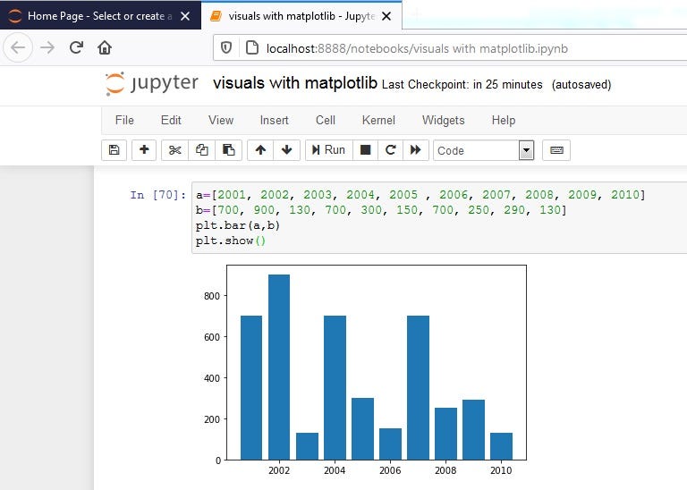
- Bar Plots: These can be plotted using:
plt.bar(x,y)
#x, y will simply be regarded as list variables</span>
Running this in jupyter notebook produces the output

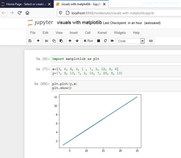
2. Plots: These can be used for constructing line graphs. The syntax is written below:
plt.plot(x,y)</span>
In Jupyter notebook, we have:

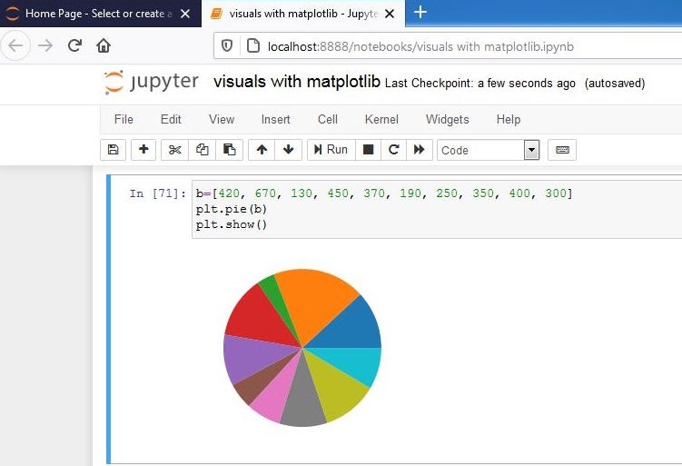
3. Pie plots: To construct a pie chart, use the command below:
Note that this takes in only one variable argument for plotting
plt.pie(x)</span>
This is properly displayed in Jupyter notebook practically:

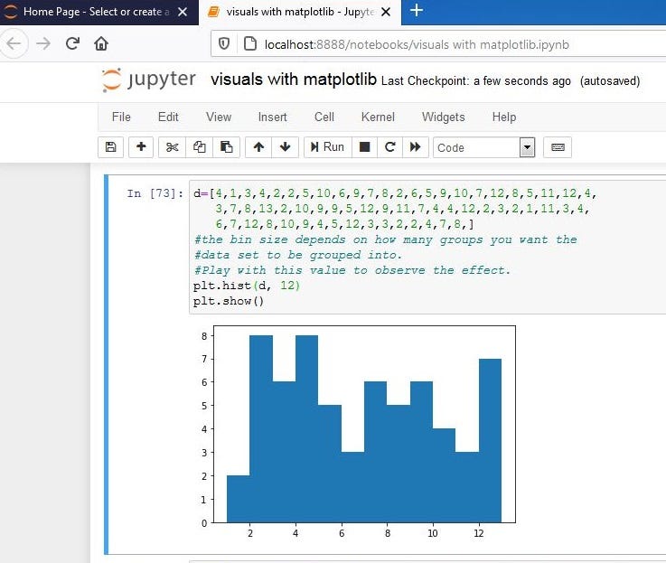
4. Histogram: To plot a histogram graph, the syntax below can be used:
plt.hist(x,n_bins)</span>
The histogram requires one list variable and number of bins (i.e the number of groups you want the automatic ranges grouped into). Histograms generally focus on the frequency of things but in ranges. Hence if you want the display of the frequency in ranges, you can use histogram but if without range, best to use bar graph.
Displayed in Jupyter, we have:

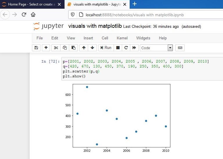
5. Scatter Plots: For constructing scatter plots, use the syntax below:
plt.scatter(x,y)</span>
Below is displays how this is shown in Jupyter:

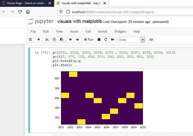
6. 2D Histogram: To plot a 2-dimensional histogram, use:
plt.hist2d(x, y)</span>
A sample of a histogram graph executed using Jupyter Notebook can be seen below:

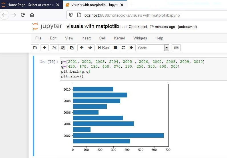
7. Horizontal Bar Graphs: To plot horizontal bar graphs:
plt.barh(x,y)</span>
A horizontal bar graph is shown below:

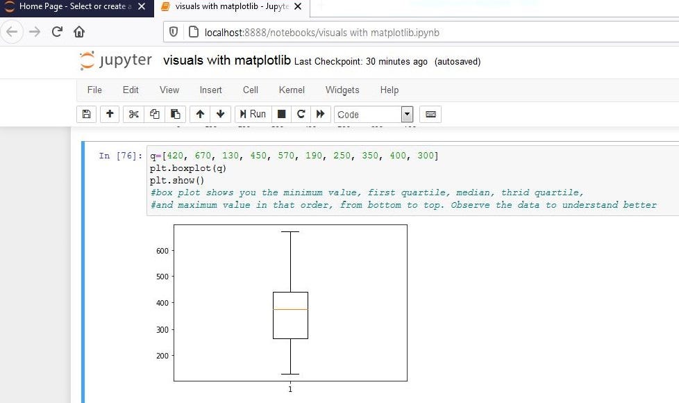
8. Box plots: Boxplots displays 5 major elements; minimum value, first quartile, median, third quartile, and maximum value. To plot box and whiskers plot, type in:
plt.boxplot(x,y)</span>
Diagram is shown below:

Other types of graphs that can be plotted using Matplotlib include polar, step, stream, stack, quiver, and log graphs.
Graphs need to self-explanatory. The previous lines of code will barely display anything reasonable to someone. It is important to add titles, labels to axis, legends, etc. Some other formatting that can be done to graphs using Matplotlib are shown below. But note to type in these codes before typing in your display command (plt.show()):
Adding a title to your graph:
plt.title(‘title of plot’)</span>
Labelling of X and y axis:
plt.ylabel(‘label_name’)</span>
Setting Limit Values to the x and y axis:
plt.ylim(range)
#the range should by two numbers separated by a comma</span>
To specify a scale type for your graph:
plt.yscale(scale_type)</span>
We have different scale types; log(log), linear(linear), symmetrical log(symlog), and logit(logit) scale
Adding legends to a graph
plt.legends(labels=(‘leg1’,’leg2’))</span>
Saving a plot
Plt.savefig(‘image name’)</span>
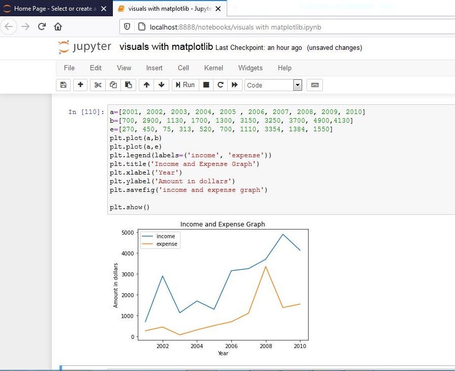
An example of how to apply some of these are shown below:

There are several other parameters that are attached to the syntax we have talked about. These parameters can be explored to see the other amazing things that can be done with Matplotlib